Shortlist
Senior level hiring facilitated by trusted recommendations.
- Branding
- Product design
Context
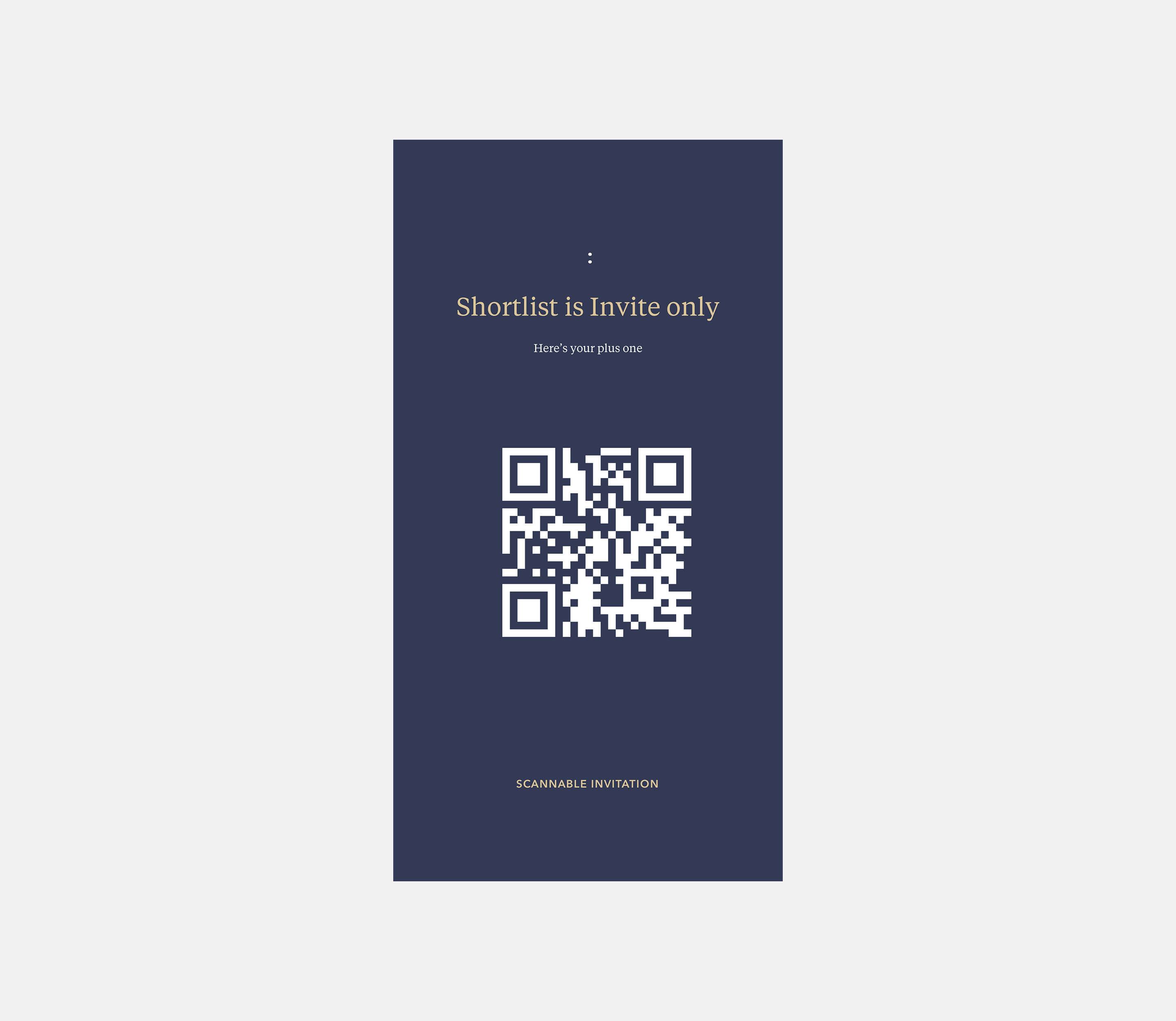
Shortlist is an invite-only community of connectors and professionals, aiming to improve the speed and cost of filling senior-level roles — primarily in finance — by providing a platform that utilises trusted and high-quality recommendations from those within the community. I was the first full-time designer at Shortlist and eventually led the product, overseeing technical deliverables and the visual experience of Shortlist.
Branding
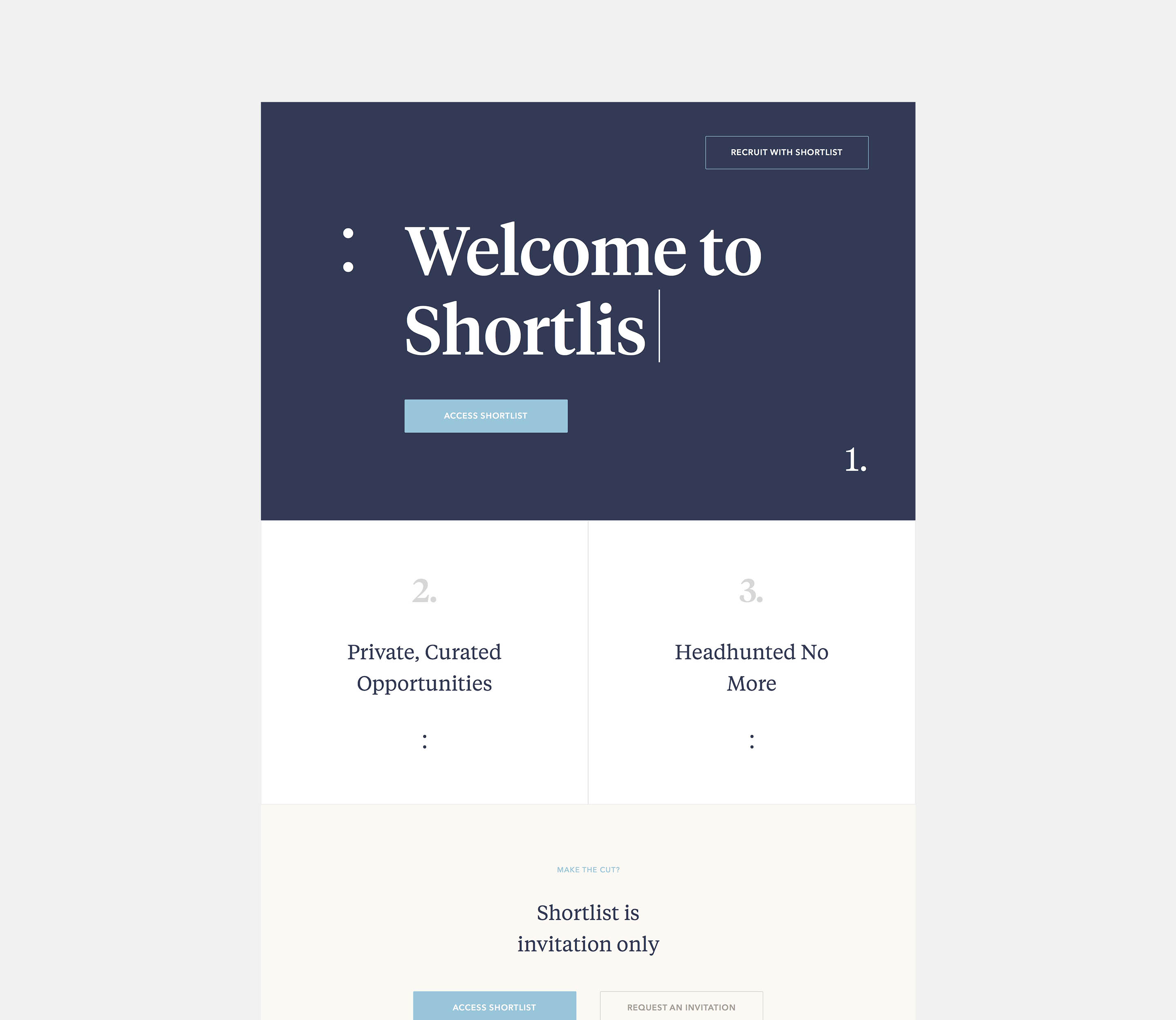
My first task was to create a new brand and personality for Shortlist. I developed branding exercises that required participation from all founding team members. These exercises resulted in forming an archetype for the company that everybody was passionate about. The team strongly agreed on an archetype we called the 'Connoisseur', defined - an expert judge in matters of taste. This archetype was fundamental to the founders and the message we wanted to communicate to the members of the Shortlist community.
We later introduced a second archetype called the 'Architect'. We provide vast amounts of information to our users, all of which had to be carefully considered. So we had to be careful not to overwhelm our users by allowing them to learn the space gradually and intuitively. The architect could carefully and thoughtfully work around these constraints.
My first task was to create a new brand and personality for Shortlist. I developed branding exercises that required participation from all founding team members. These exercises resulted in forming an archetype for the company that everybody was passionate about. The team strongly agreed on an archetype we called the 'Connoisseur', defined - an expert judge in matters of taste. This archetype was fundamental to the founders and the message we wanted to communicate to the members of the Shortlist community.
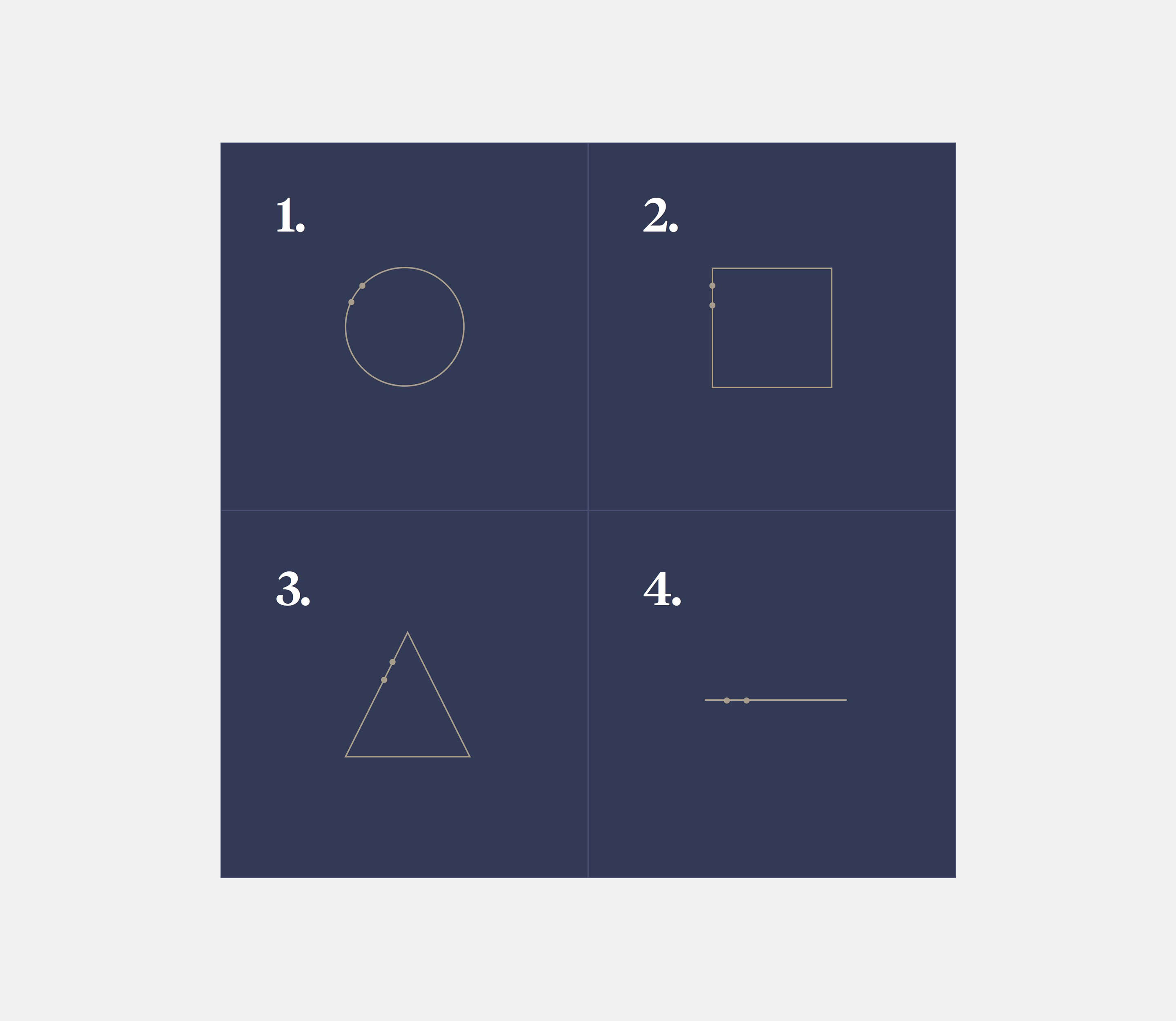
We brought the two personalities together; the rich colours and typography of the connoisseur and the bold shapes and lines of the architect. This birthed a new visual language for Shortlist.
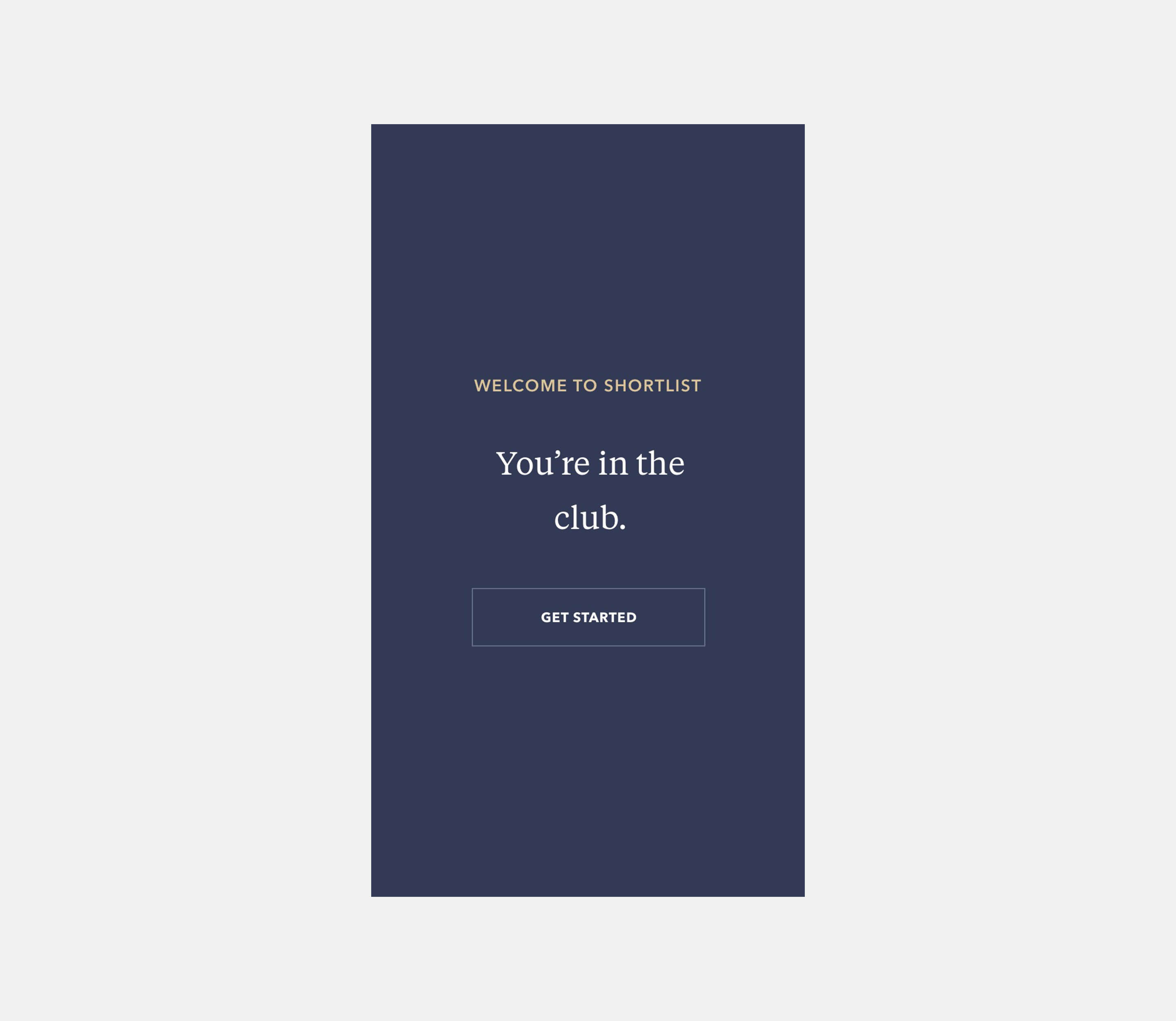
iOS
Whilst the new brand look settled, I was tasked with designing the IOS app that would eventually replace the desktop app as the primary tool for connecting professionals to senior-level roles. 6-months of designing, testing and iterating lead us to our Version one mobile application. I eventually handed off the visual design and moved into user testing and research whilst managing product deliverables.
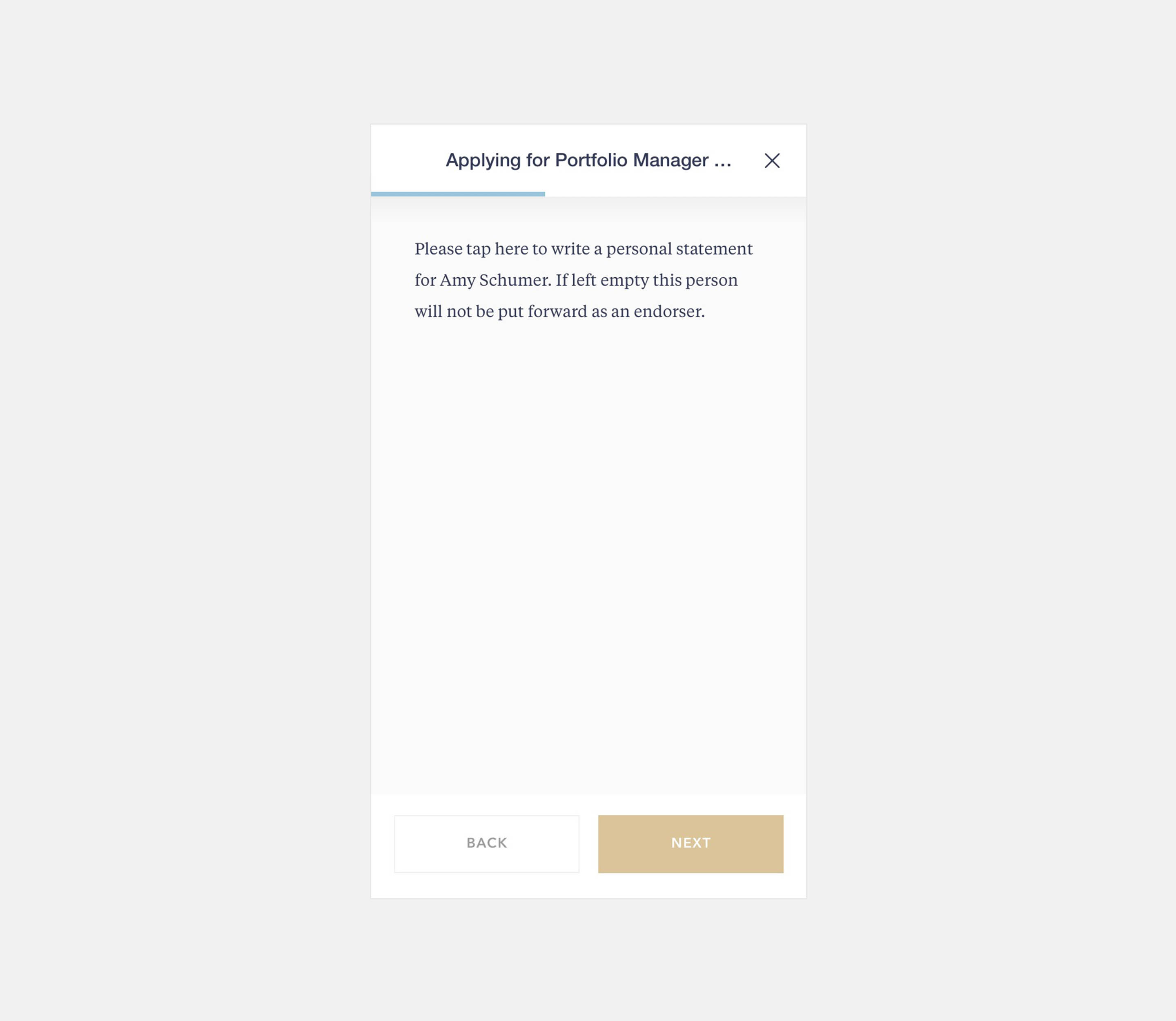
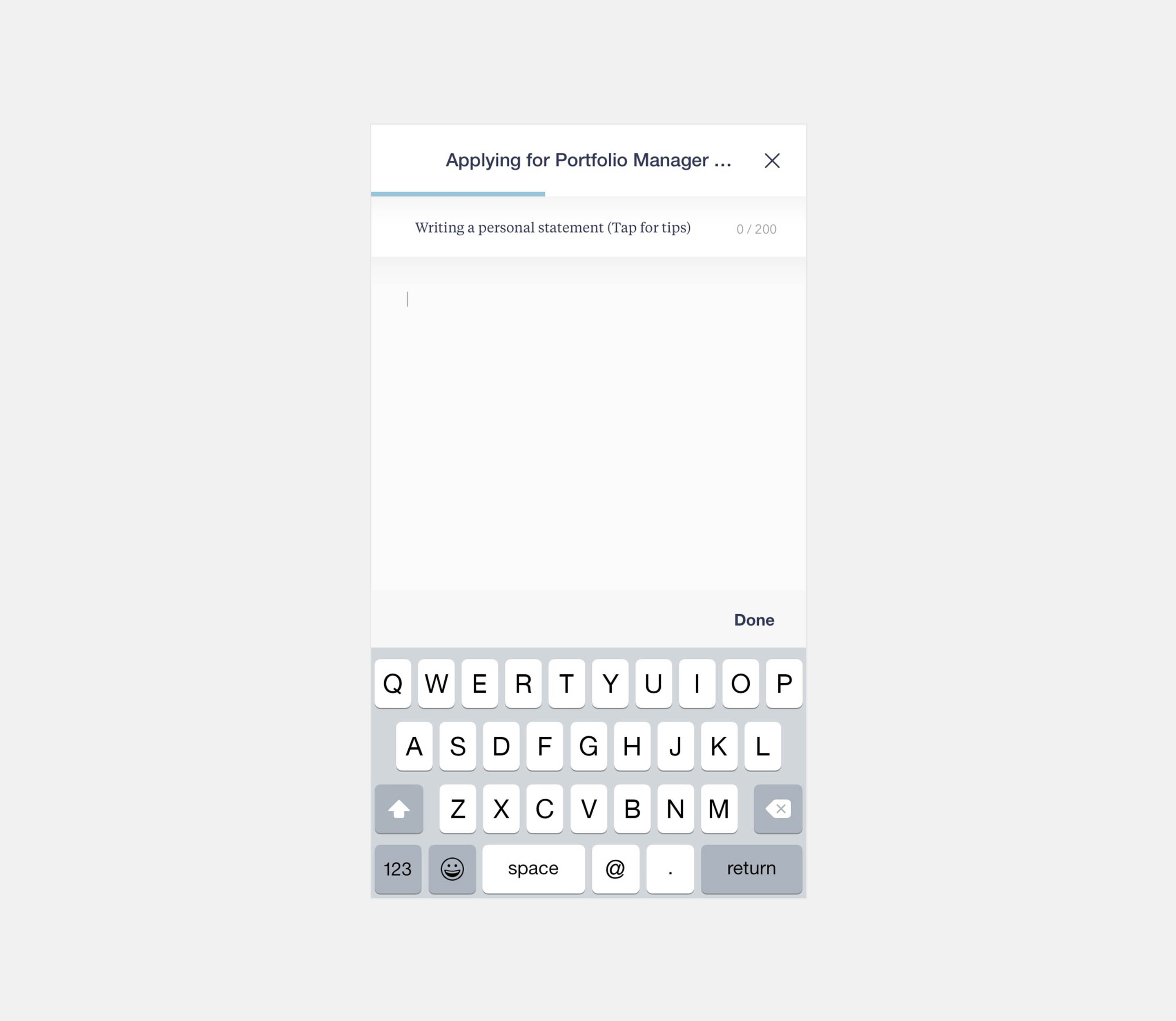
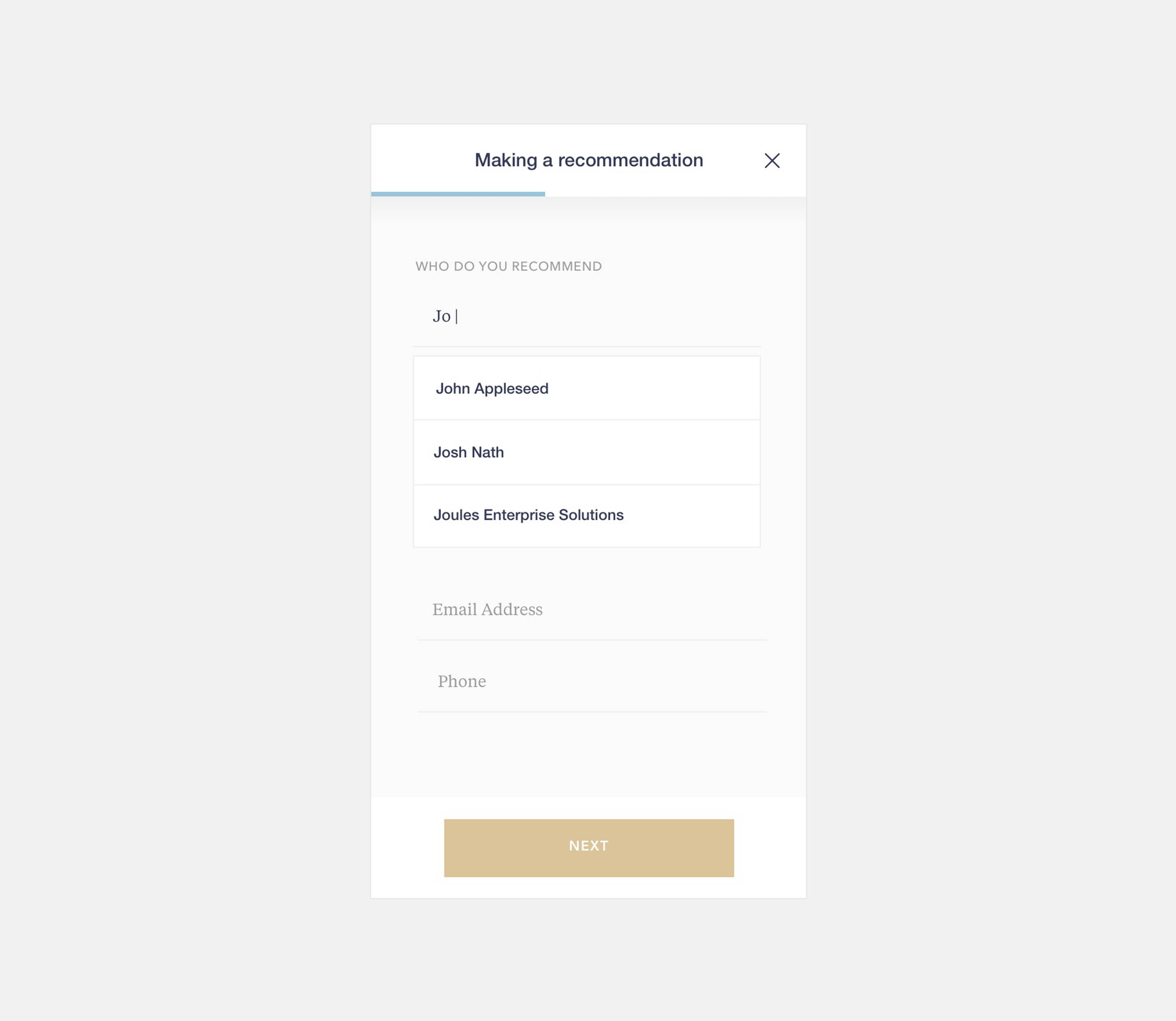
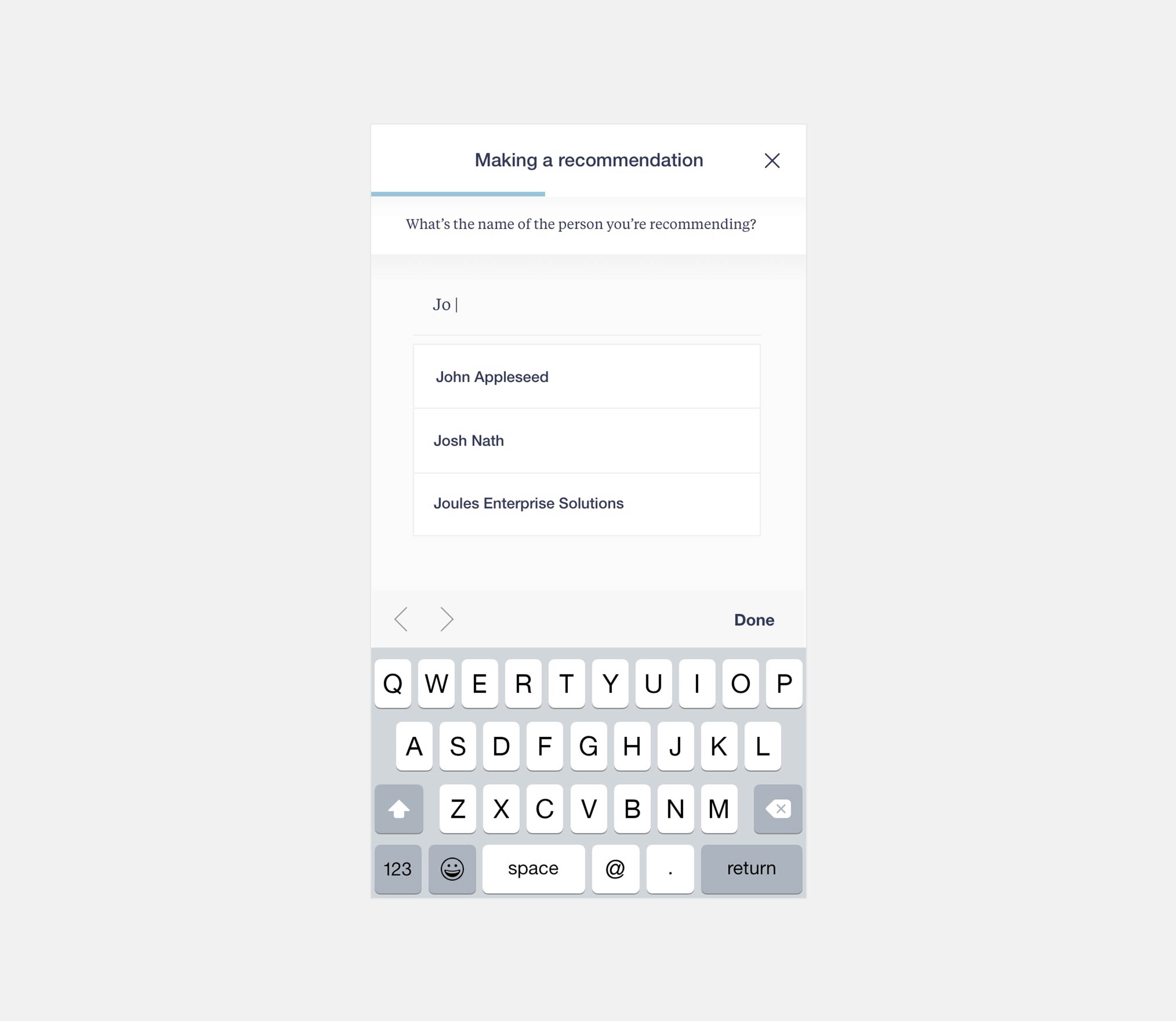
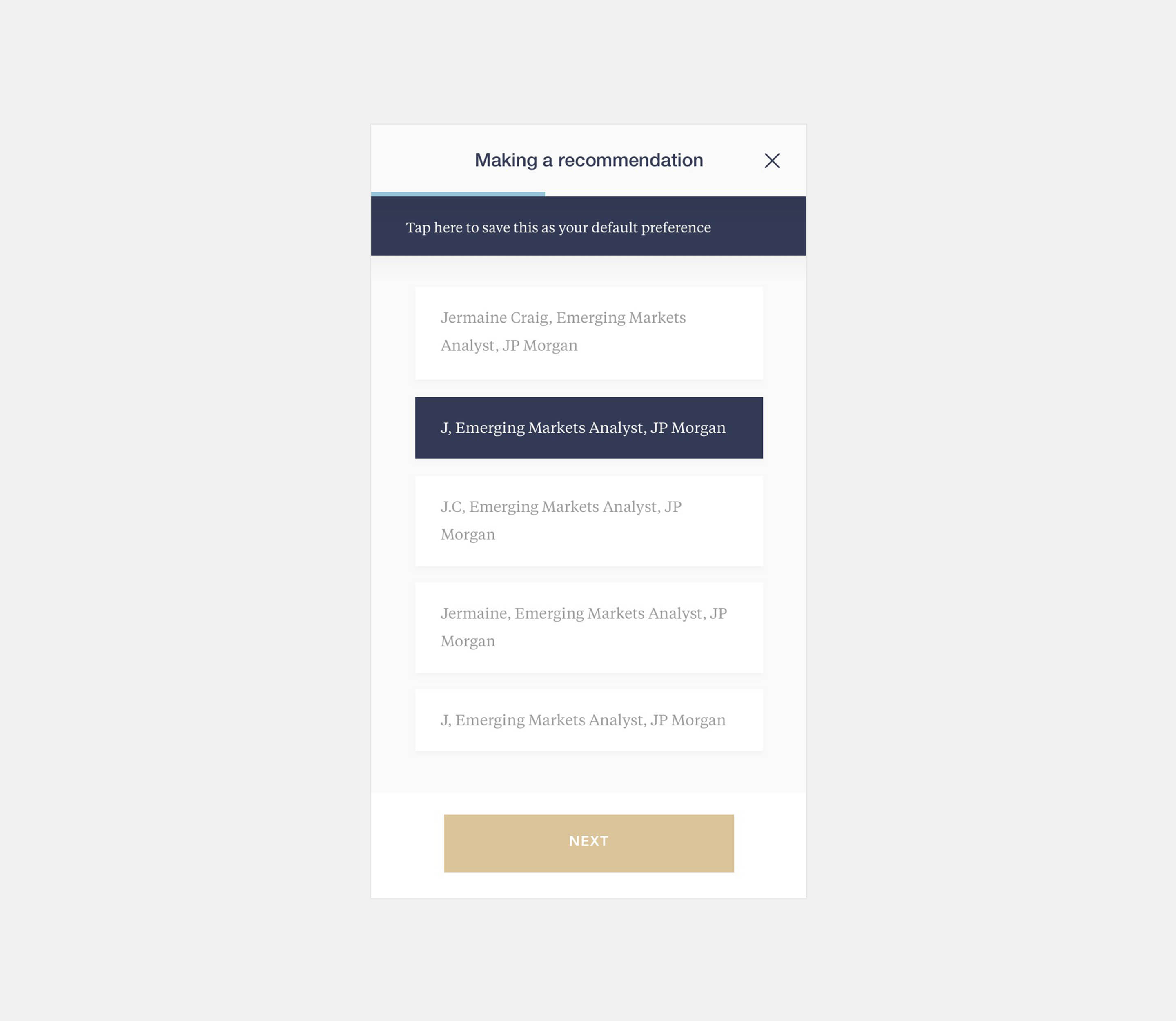
Typing assistance
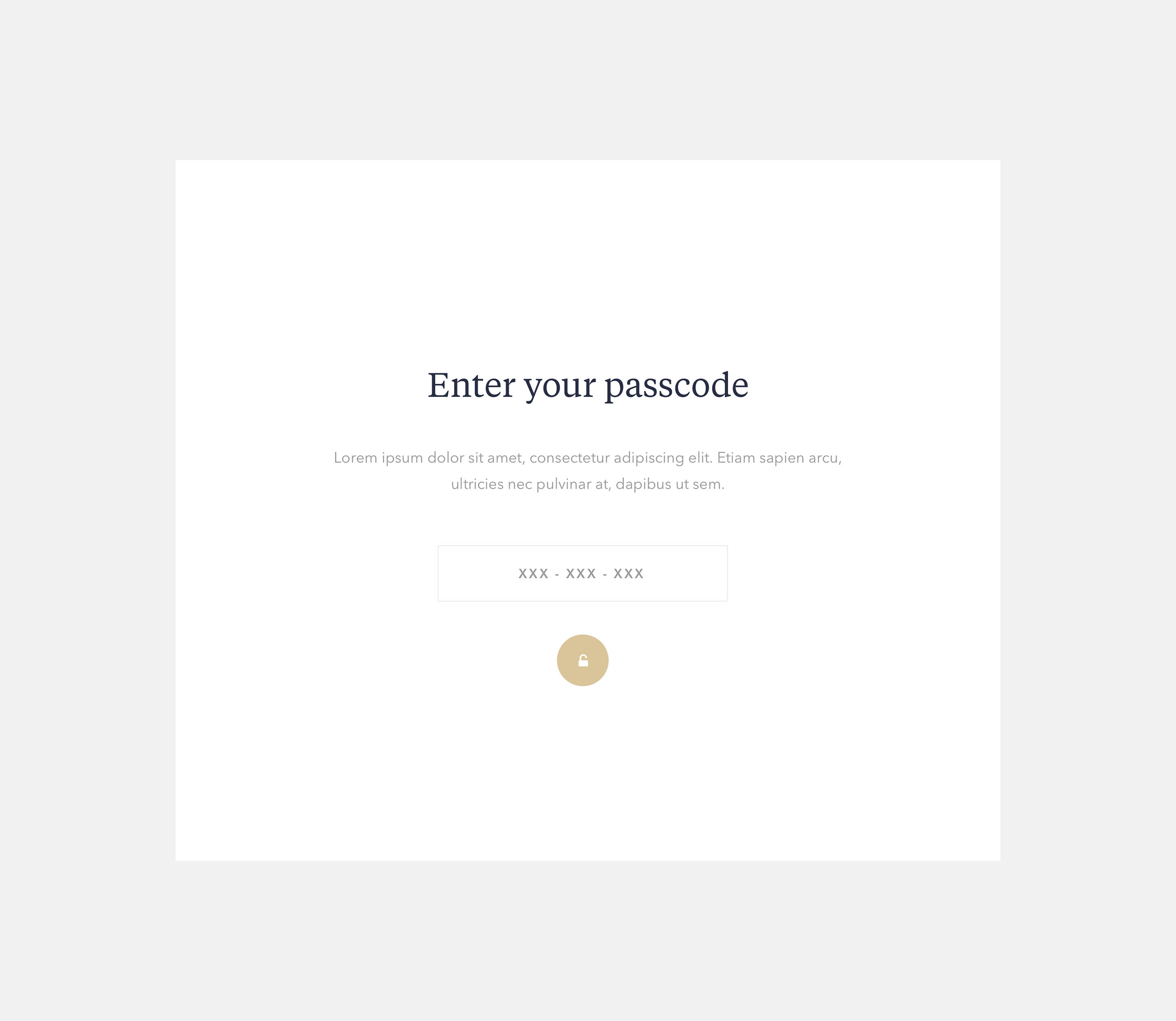
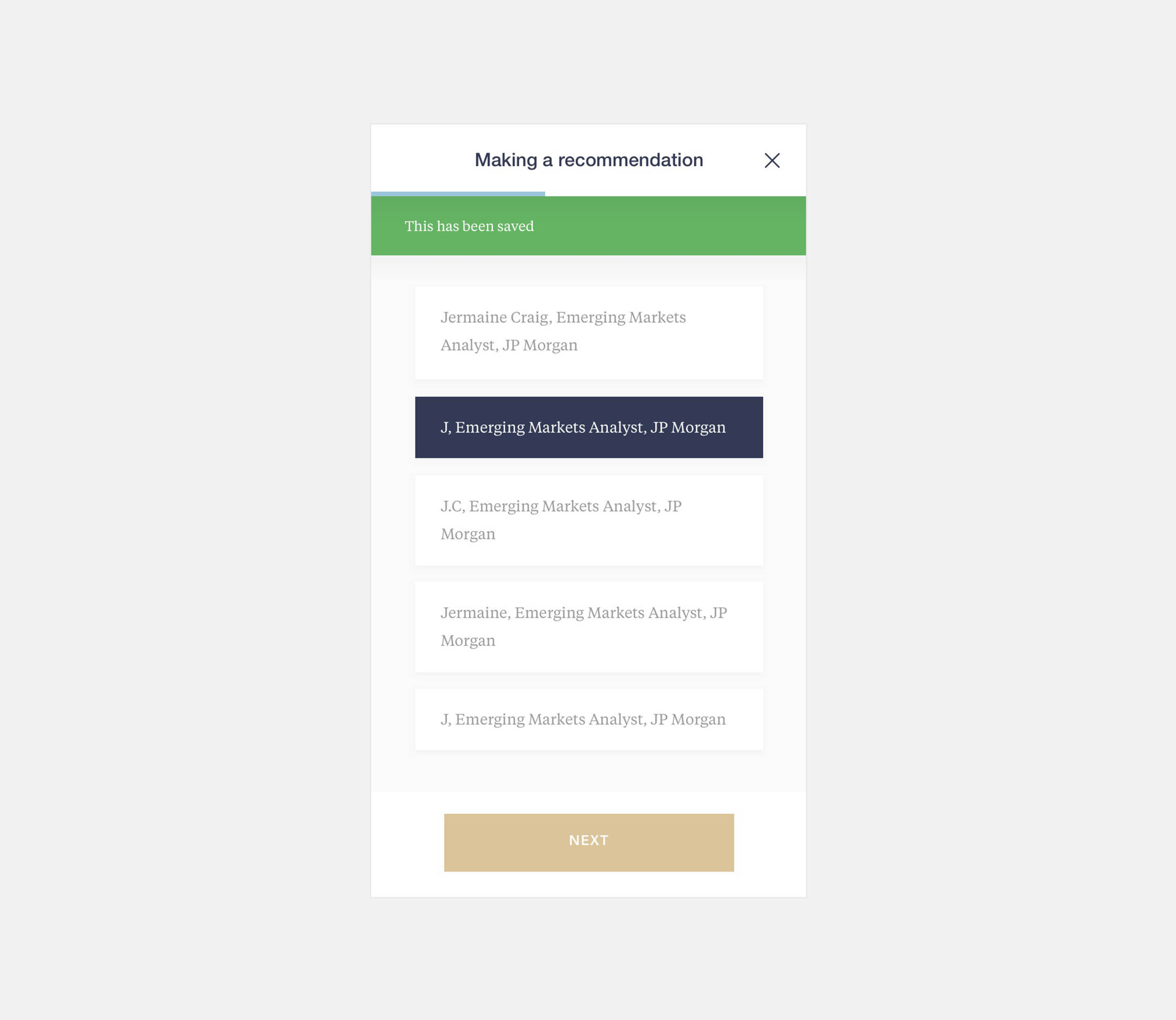
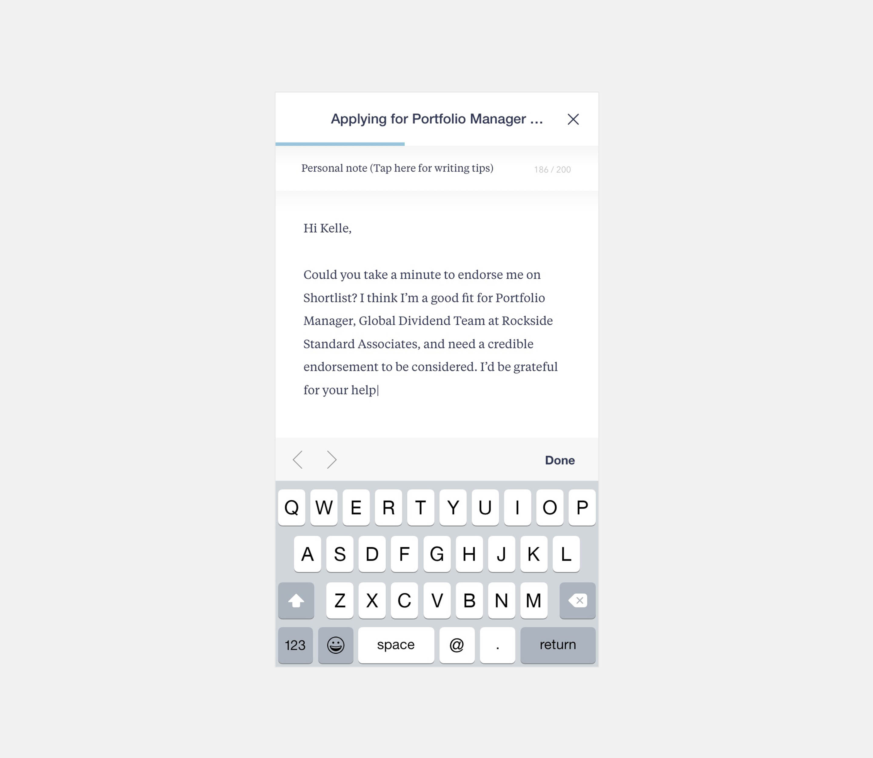
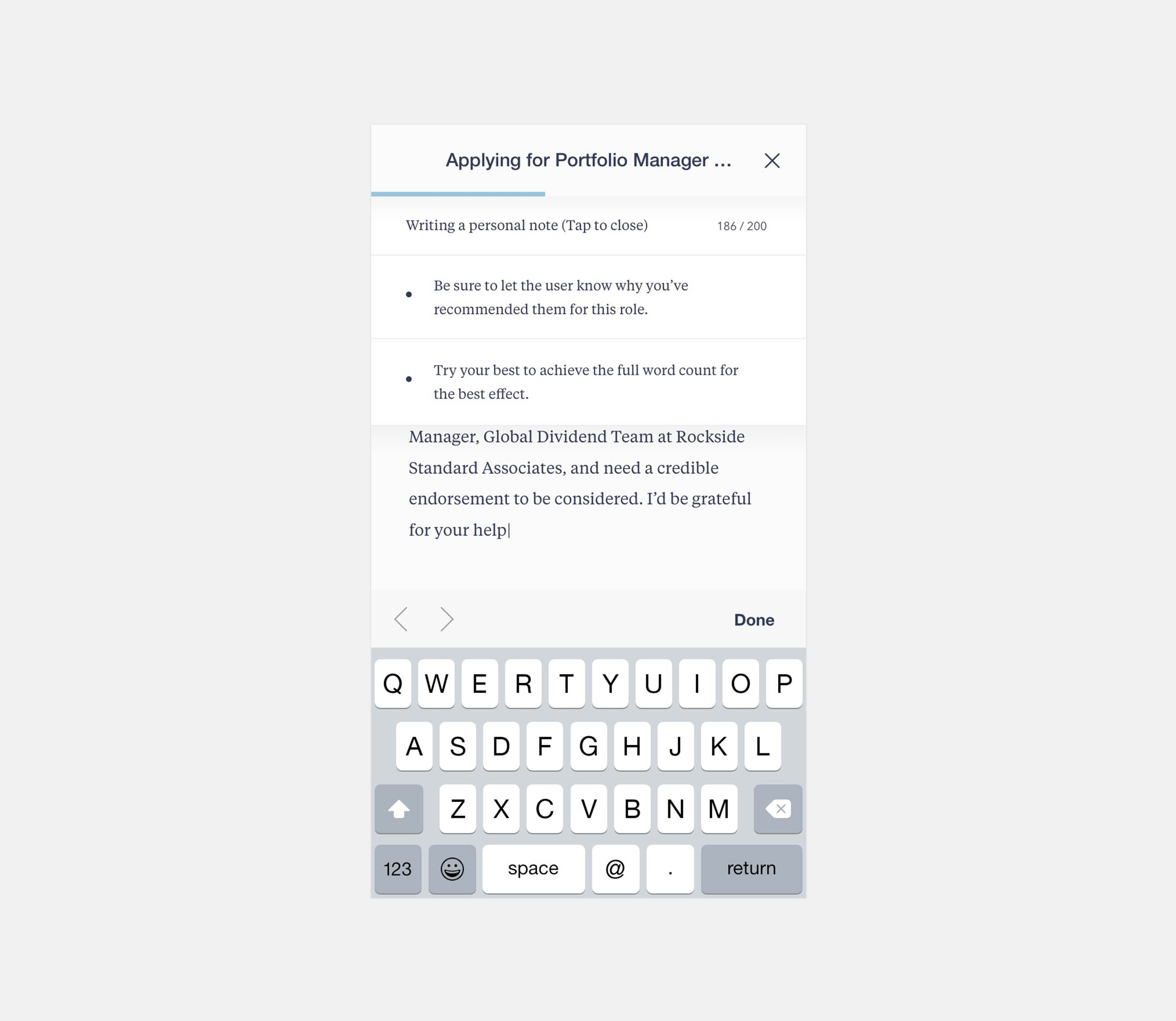
Unavoidably, a large part of the Shortlist mobile experience required users to write long-form text. With the apple keyboard taking up so much real estate, we quickly ran into problems with the amount of space our members had to craft recommendations effectively. So we developed a solution called 'Type Assist', which appeared every time the user was interacting with inputs and selections. Type assist allowed us to guide users and present a wide range of valuable interactions.
Visual training
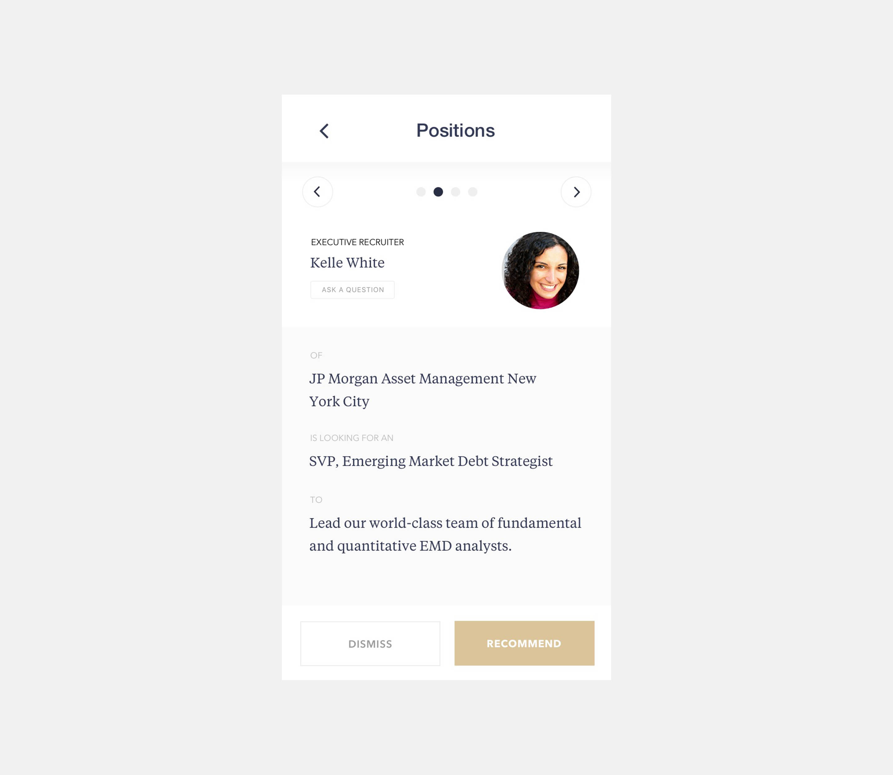
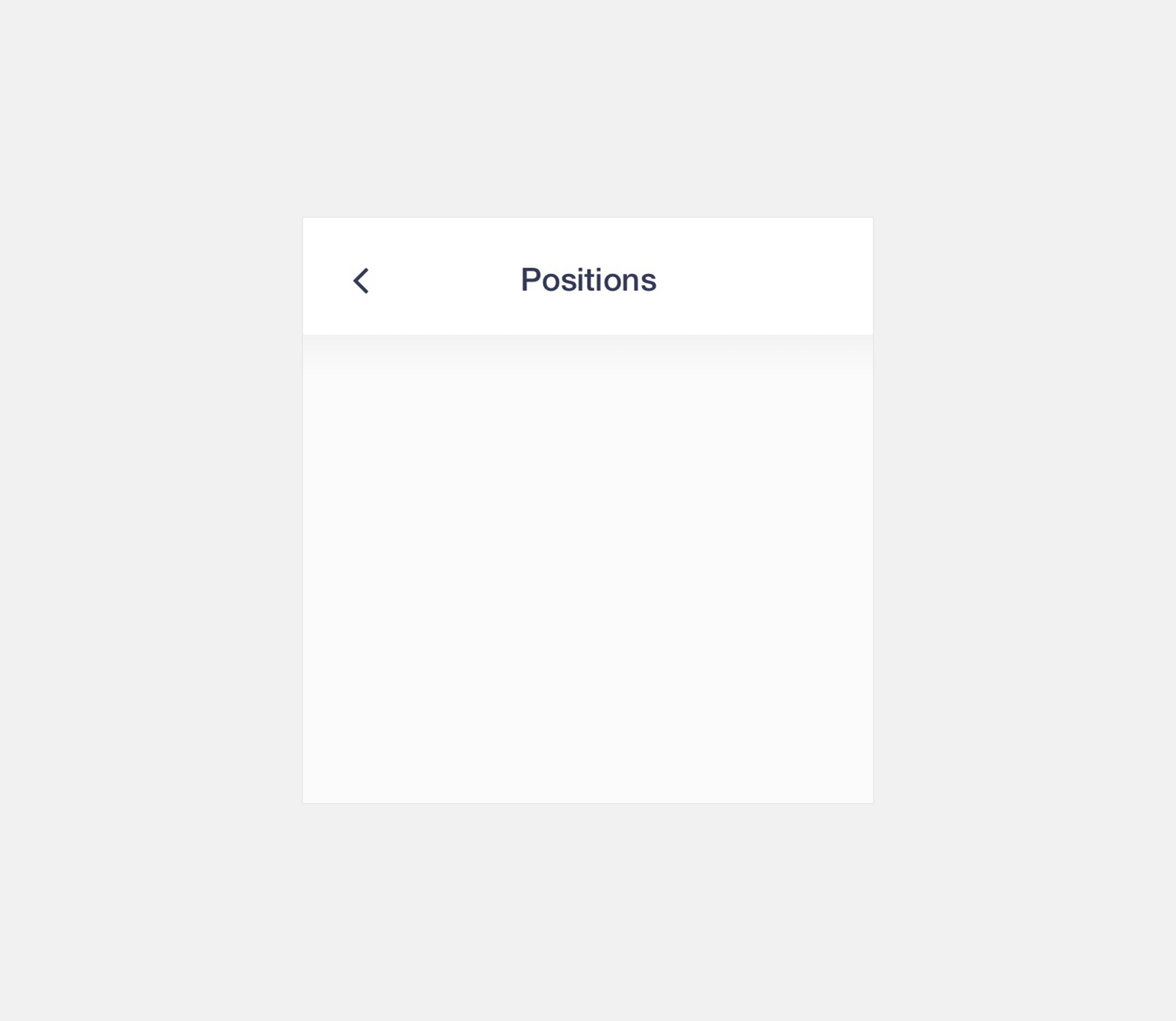
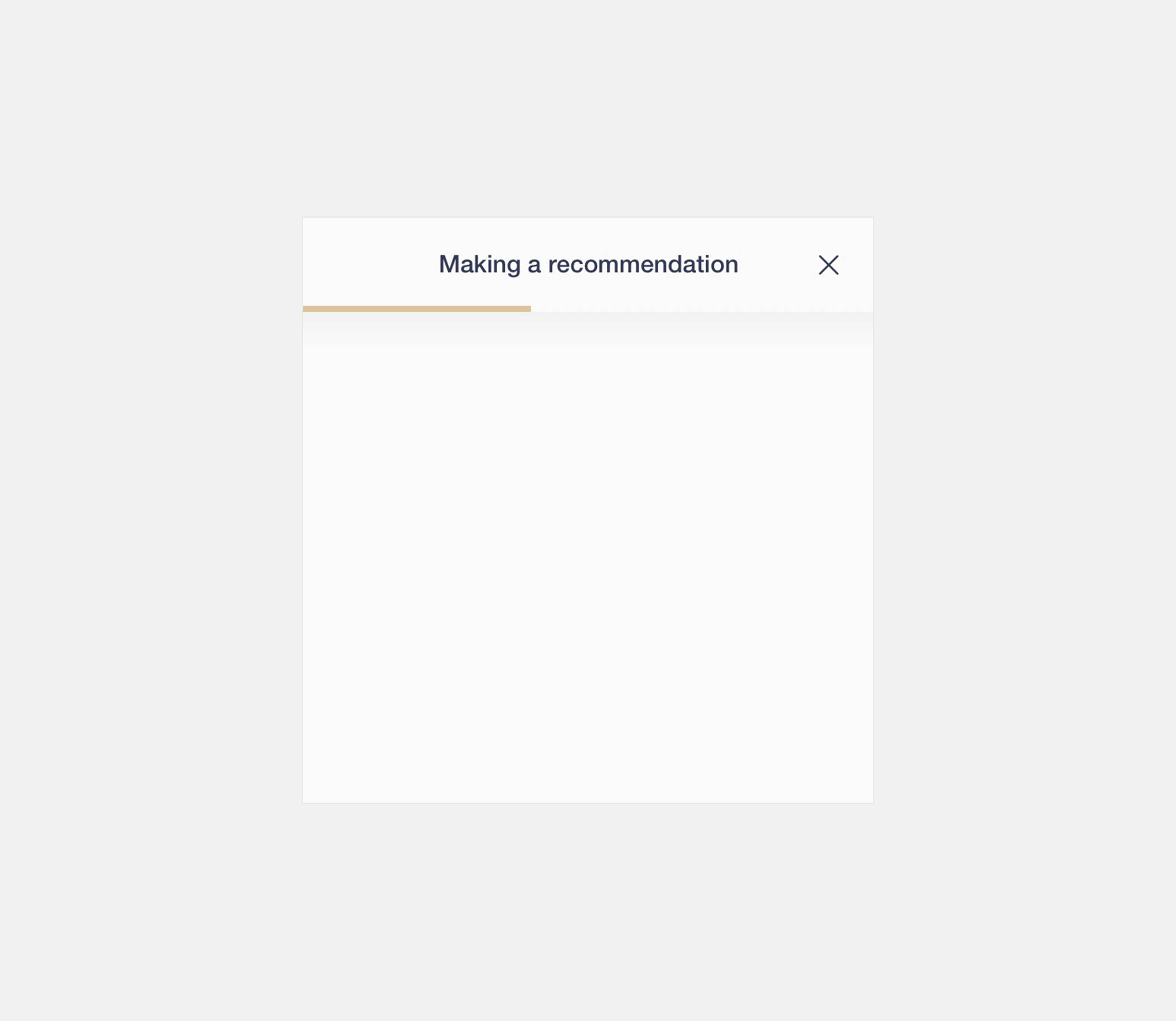
As the mobile app grew in complexity, a problem that members repeatedly mentioned in user testing feedback was the inability to understand what they were doing when re-opening the app after having put their phone down. We established three different visual modalities to train members. We tweaked the header designs and screen transitions to communicate these modes: Home, items, and processes. We easily applied these modes to different facets of the user experience, such as viewing positions, sending messages or viewing applications, etc.
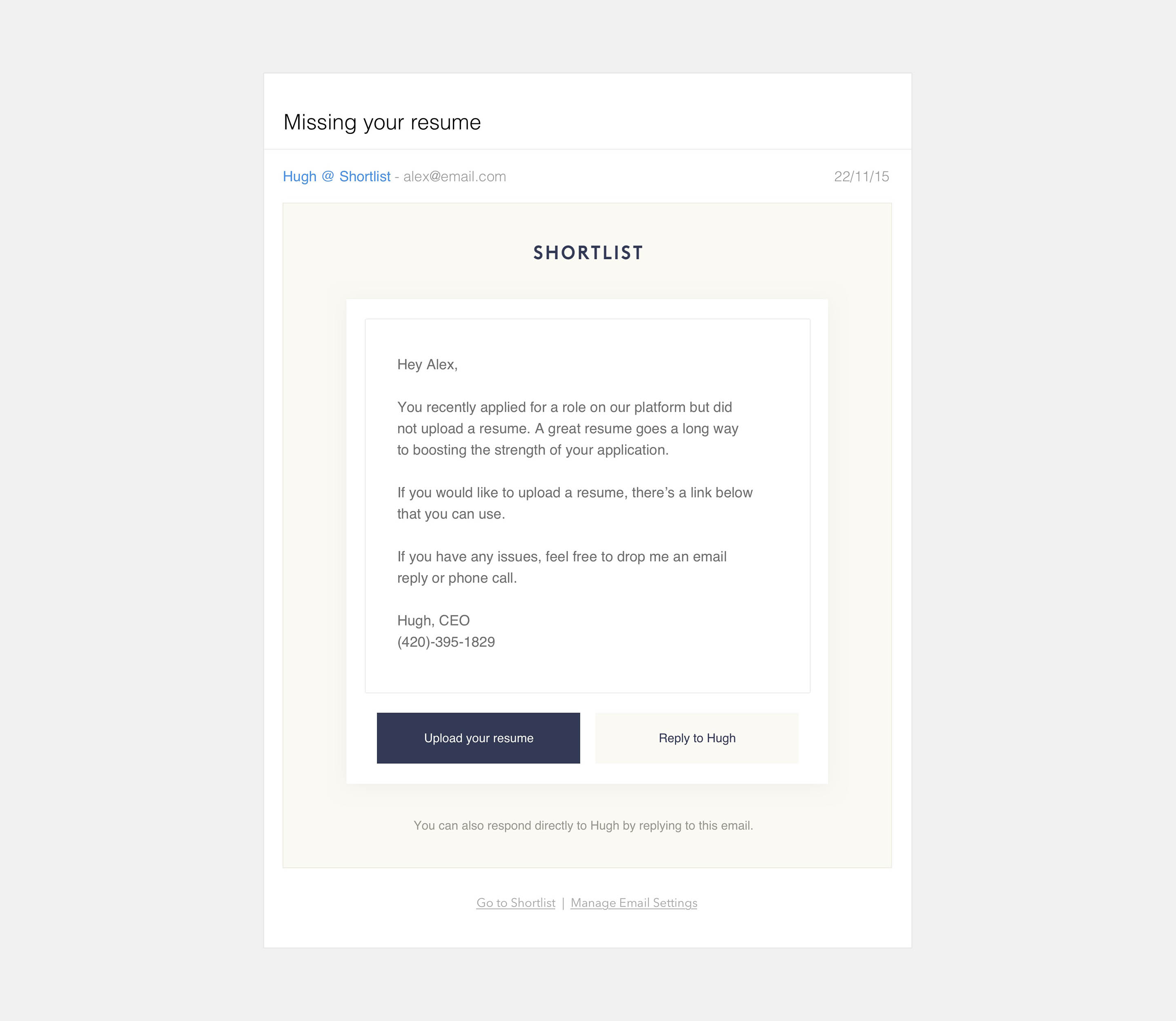
Human language
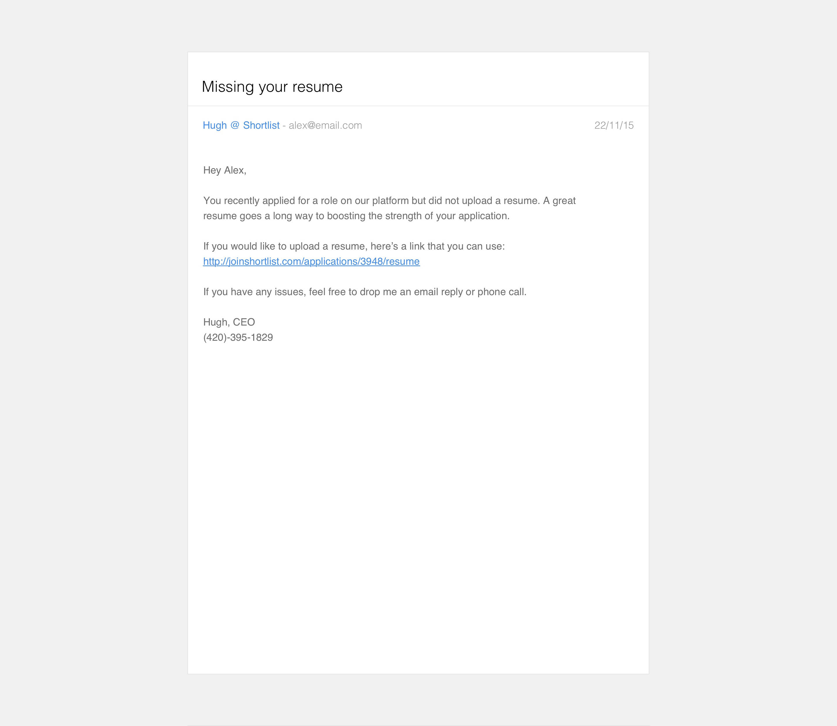
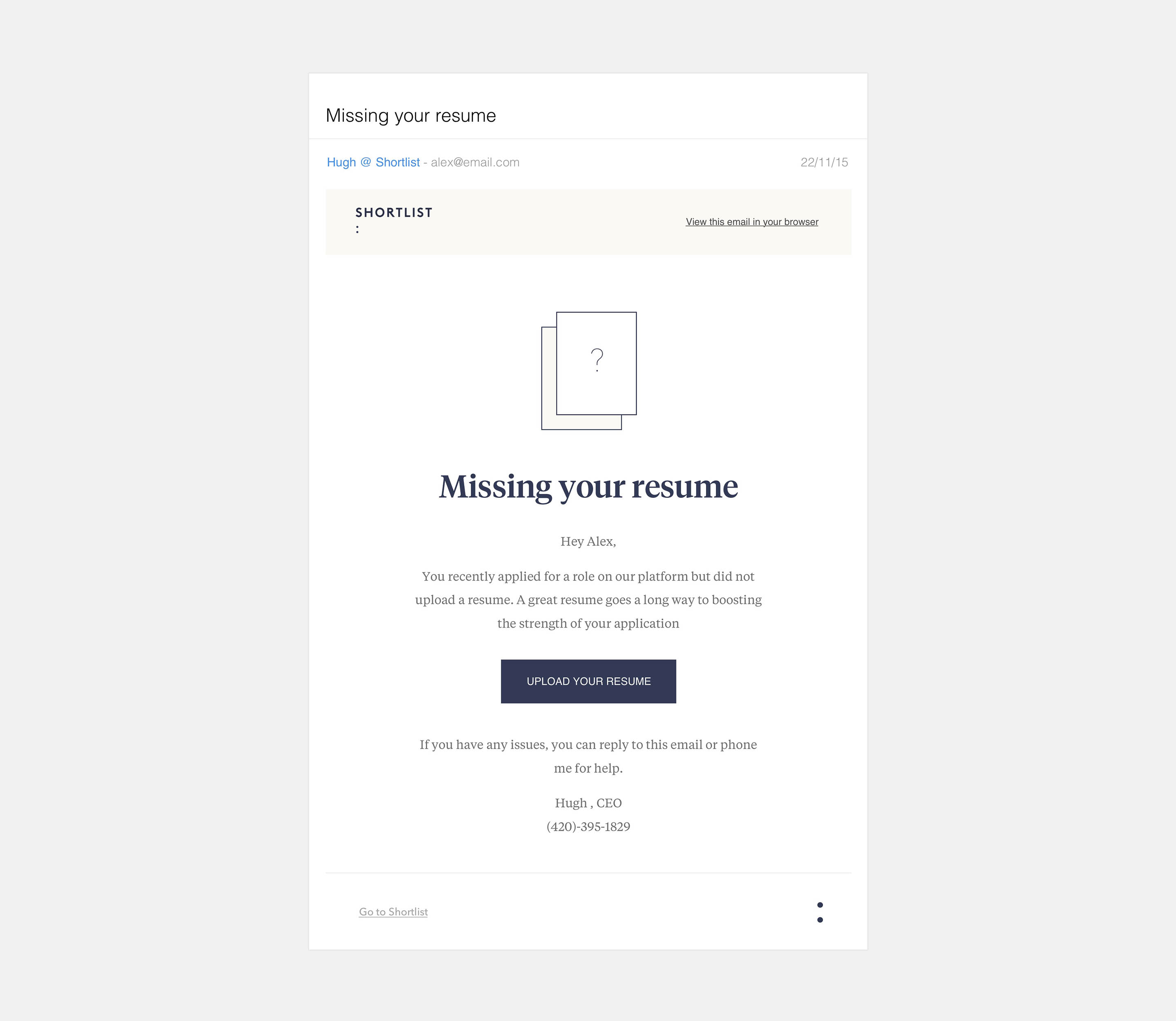
Does the Shortlist experience feel human? We had to continually ask ourselves as we designed different parts of the Shortlist experience. It was especially important when dealing with email communication between ourselves and members of the Shortlist community. We wanted to make sure our email communication felt as personal as it could and show off our brand style. The answer was a hybrid between a plain text email and a visually designed email, which allowed us to inject some of our brand whilst the warm feel of a handwritten email.
This was the largest mobile application I've worked on. I, along with my team created more than 250 screens. I developed an extensive design manual for Shortlist, which you can view here.